Navigation And Usage
OTRS has a modular structure. All of its objects, lists, widgets and overviews are configurable components, but the configuration should be done in the same manner. This chapter explains the general usage of the OTRS agent interface.
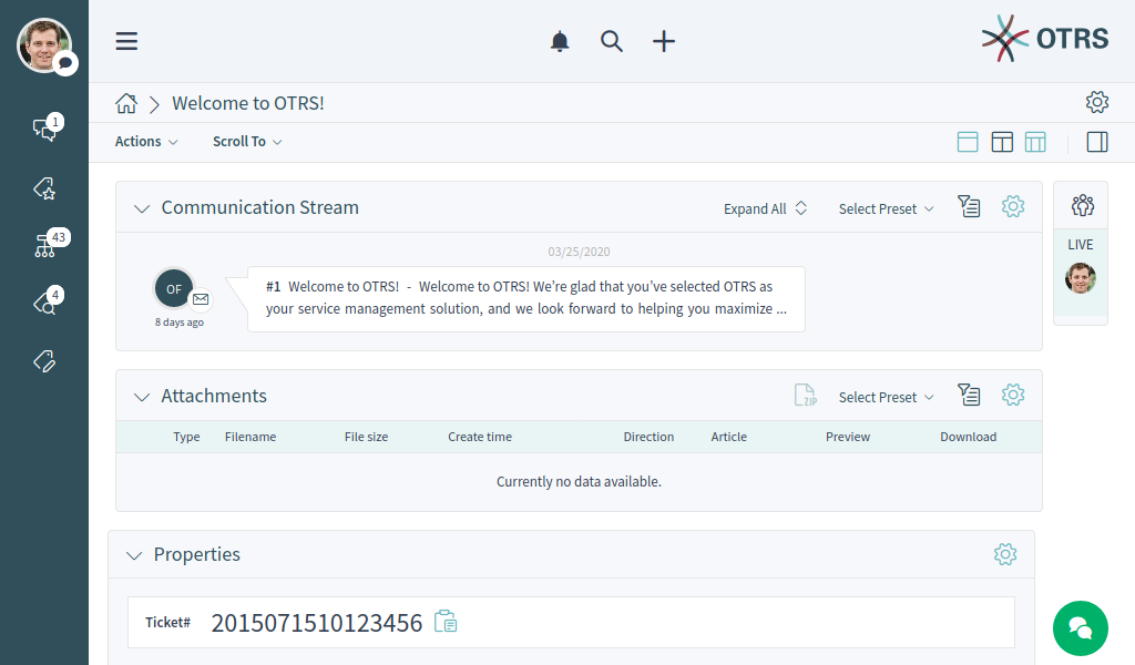
The agent interface acts as a dashboard for the agents. This is a complex screen where most of the actions can be accessible.
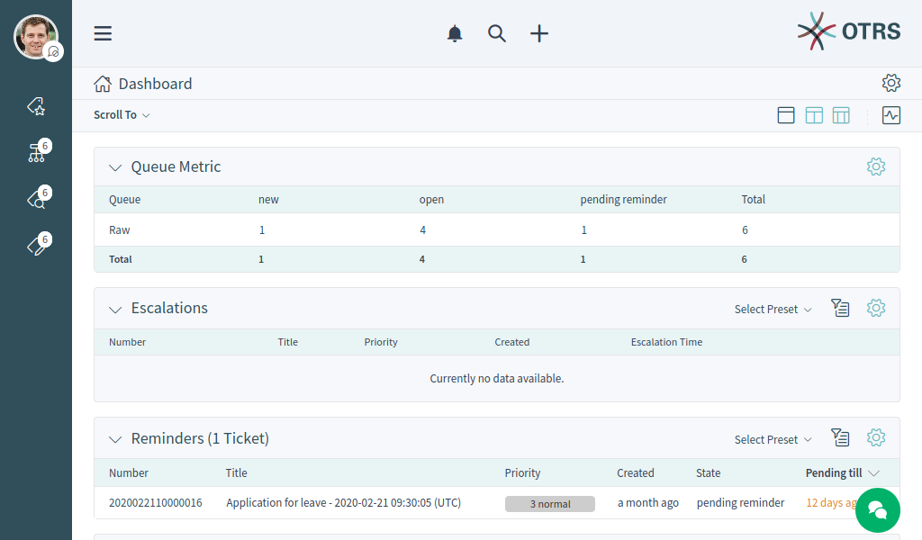
Personal Dashboard
Navigation Elements
On the left side of the screen there is sidebar called organizer. The organizer sidebar contains the personal settings of the current agent and shortcuts to business object lists. The items of the organizer sidebar can be customize in the Personalization menu. This organizer sidebar is hidden by default when using OTRS with a mobile device.
Hovering the mouse over a business object list icon in the organizer sidebar opens a preview of the according business object list.
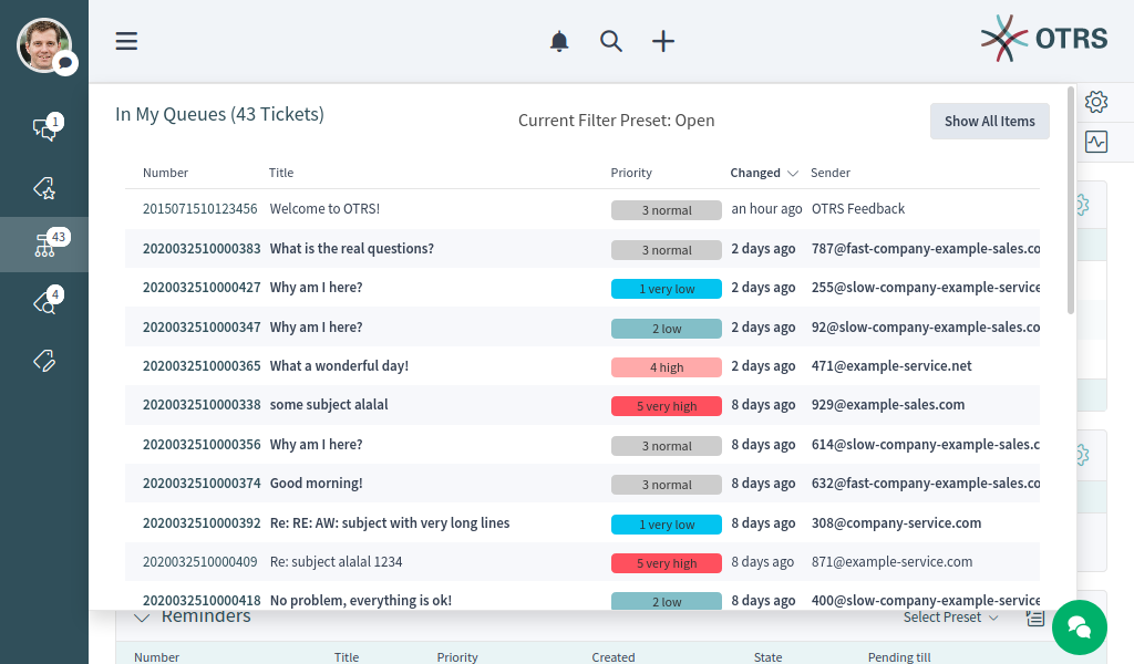
Business Object List Preview
The screen has a header bar with the most important menus. This part of the screen is visible in every pages.
The main menu contains links for the most important screens of the system.
Main Menu
On the center of the header bar, the notification menu, the search field and the action menu can be found.

Header Toolbar
- Notifications
- Clicking on the bell icon will show the currently unread notifications. There is a button Show All to open the notification list and to select any previous notification.
- Search
- Clicking on the magnification glass icon will display a search bar to search for everything on the system.
- Action menu
- Clicking on the plus icon will open a menu to create new business objects.
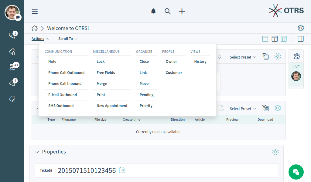
Below the header bar the breadcrumb bar is located, which helps to easily identify where the agent currently is and can display toolbar or actions. The breadcrumb bar consists of two rows, and both rows have icons in its both sides.

Breadcrumb Bar For Business Object List

Breadcrumb Bar For Business Object Detail View
The first row of the breadcrumb bar contains the breadcrumb itself, which acts as a path indicating the current place where the agent is. On the right side of this row the screen configuration is located. This part of the breadcrumb bar can contain buttons for navigation between business objects and a back link to the business object list.
The second row of the breadcrumb bar can be different for business object lists and business object detail views.
- For business object lists, the second row of the breadcrumb bar can contain export and bulk actions on the left side, and filter presets, filter possibilities and pulse mode on the right side.
- For business object detail views, the second row of the breadcrumb bar can contain Actions menu and a Scroll To menu regarding to the business object, the column layouts and a button to show or hide the sidebar in the business object detail view.
These features and actions are displayed only, if the selected business object list or business object has such a menu.
The screen configuration is accessible via the gear icon. Every screen has such a menu, and the content of this setting depends on the screen.
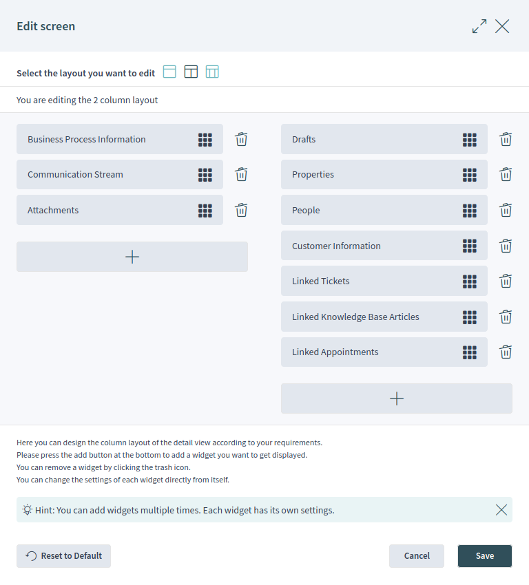
Screen Configuration For Two-column Layout
The same configuration screen can be used for all column layouts.
Select the layout you want to edit in the top of this screen. Next, the widgets of the current screen can be added, removed or rearranged. Any widget can be added multiple times. Each widget has its own settings.
For large screens, different column layouts can be selected. On small screens or in mobile view only the one column layout is usable. The position of the widgets can be customize in the screen configuration.
Some business object detail view, like the detail view for Tickets, can contain a sidebar in the right side of the screen. This sidebar can be hidden or shown from the breadcrumb bar.
The content area of the screen can display a dashboard, business object lists and business object detail views. These screens can contain a list of business objects or multiple widgets. The number of the widgets and the content of the widgets depend on the screen what the agent currently sees. Every widget can be customized in its widget configuration.
In the bottom right corner, the chat bubble is displayed. The chat bubble is always visible at the top of any other elements to give a quick access to Chat.
Business Objects
All components are called business objects. These business objects can be:
- Tickets
- Knowledge Base Articles
- Customers
- Customer Users
- Notifications
- Statistics and Reports
- Other similar objects
The business objects have list views and detail views. The views have a similar structure and user experience.
Business Object Lists
The business object list displays a configured set of data from business objects.
Business Object List Example
If there are more items, a note at the end of the list informs about how many more items there are that cannot yet be displayed. By scrolling down, the business object list loads automatically more items until the end of the list is reached. The visible size of the list is remembered for reloads and navigation.
The page breadcrumb indicates the total number of found business objects depending on the filter criteria for the business object list.
The business object lists periodically check on the server side for data updates. For the list updates, default mode and pulse mode are available. You can activate this mode by clicking the pulse icon in the breadcrumb bar of business object list.
In default mode, new items that have to be shown in the current displayed list are not shown immediately. A notification on the the top of the business object list informs about new data. Clicking on this notifications refreshes the list and shows the list with updated data.
In pulse mode, update for an item displayed in a business object list are applied immediately. The business object list will be refreshed periodically including newly added or removed items. The rows associated with the affected objects are highlighted for a short time to indicate a change. If the update affects an item that is no longer be displayed in the current list, the corresponding item is highlighted in red and after a few seconds it will be removed from the list.
The columns of the business object lists are sortable. Clicking on any visible and sortable column replaces the current existing sorting criteria and sort the data by the column. A sorted column is indicated by a small arrow at the according column.
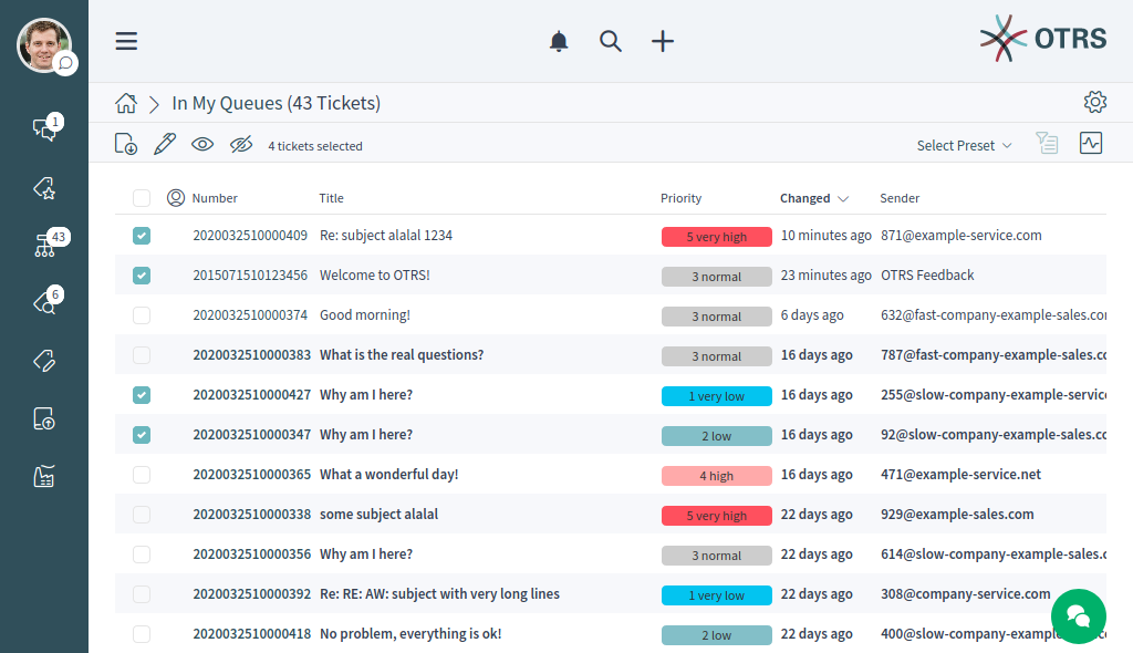
The business object list can support exporting or editing multiple objects at once. The export feature allows to export one or more objects selected in the business object list, and the bulk edit feature allows to edit the properties of the selected objects at once.
To export the objects:
- Select one or more object in the business object list.
- Click on the download icon in the breadcrumb bar.
- Add, remove or rearrange the columns and select the export format.
- Click on the Download File button.
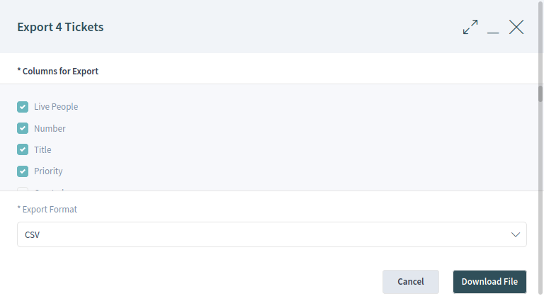
Business Object List Export
To edit the properties of the objects:
- Select one or more object in the business object list.
- Click on the pen icon in the breadcrumb bar.
- Change the properties of the selected objects.
- Click on the Execute Bulk Action button.
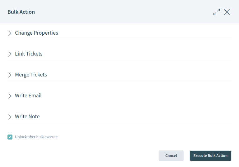
Business Object List Bulk Action
The business object list supports inline editing of objects. Not all properties can be edited inline.
To edit a property of an object:
- Hover the mouse over the property value in the list and wait for the popover field.
- Change the value of the property.
- Click on the Save button.
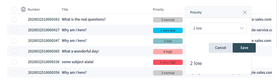
Business Object List Inline Edit
It is possible to select all objects that are currently visible in the list. To do this, select the checkbox in the table header.
Note
If the list contains more objects as currently could be displayed, the non visible objects are not selected.
To select all objects that are currently not visible:
- Scroll down the list to display all objects.
- Scroll up and select the checkbox in the table header.
The table header will display, how many objects are selected.
The business object lists have a screen configuration and a non-permanent configuration that can be set by using the filter functions. The screen configuration of a business object list can be configured using the cog wheel icon in the upper right corner. The non-permanent screen configuration is never saved and synchronized, but allows the saving of named filter presets.
Business Object List Screen Configuration
In the screen configuration can be added, removed or rearranged the columns displayed in the business object list. The list can be sortable and filterable, and the number of results can be selected. This number of objects will be loaded at first time the list is displayed and for each time the list is scrolled down.
The filter section allows to manage filters to be applied to narrow the list of business objects. It is also possible to save a configured filter setup as a filter preset. The saved filter presets and the filter section is available using the filter icon in the breadcrumb bar.
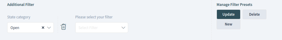
Business Object List Filter Preset
New filter presets can be created, as well as the existing filter presets can be updated or deleted.
To create a new filter preset:
- Click on the New button.
- Configure a filter setup by adding some filters.
- Enter a name for the filter preset.
- Click on the Save button
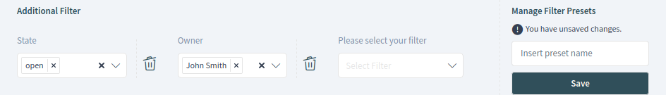
Business Object List Filter
When a filter is selected, a new filter field will be displayed to select an other filter. There is a huge list of possible filters, and there is no limitation for the number of used filters. There are filters with text input field, and some other filters can have a drop-down list to select only one or multiple options.
The filters can be removed with the trash icon next to the field.
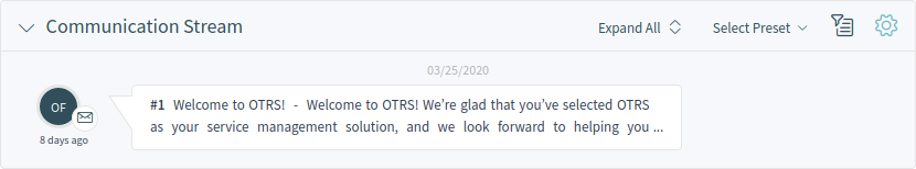
Business Object Detail Views
Clicking on an object in the business object list opens the detail view of the object. The detail view remembers the context of the business object list. If you go back to a business object list from a detail view, the business object list is opened again and the object is highlighted, if it still exists.
Business Object Detail Example
The business object detail view has an Action menu in the breadcrumb bar. The number of actions depends on the configuration and the type of business object. Each action opens a dialog in the right side of the screen, which contains a form for the selected action.
Business Object Detail View Actions
The content area of the business object detail view consists of widgets that are hold the main content. The widgets can be displayed in one, two or three column layouts. The number and type of the widgets depend on the displayed business object and can be customize in the screen configuration.
Use the Scroll To menu in the breadcrumb bar to jump quickly to the selected widget. This menu contains all widget names that are visible on the screen, and it has the same layout as the widgets are configured in the screen configuration.
Each widget has a header with the name of the widget and a chevron icon to collapse or expand the widget itself. The Select Preset option shows the configured and named filter from the Filter section. Finally, the widget configuration is located in the right side of the header.
Widget Overview
The content of a widget can be a table or a content area, or can be consisted of multiple content cards.
Most of the widgets have a filter possibility to narrow the results displayed in the widget content. The filter options can be shown or hidden with the filter icon.
See also
The widget filters work as the same way as the business object list filters. The widget filters also support filter presets.
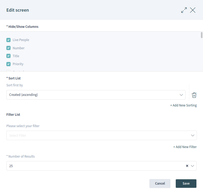
The widget configuration is accessible via the gear icon. Every widget has such a menu, and the content of this setting depends on the widget.
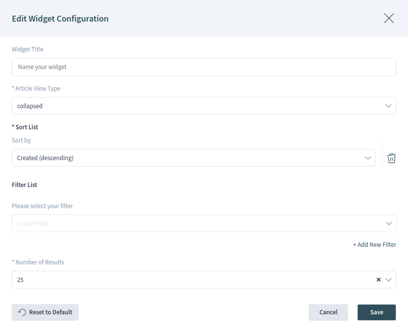
Widget Configuration
The following configuration options can be available for the widgets. The configuration options depend on the widget. The fields marked with an asterisk are mandatory.
- Widget Title
- Here can be changed the default name of the widget. If a new name is entered, this name will be displayed in the header of the widget.
- Hide/Show Columns
- In this list can be selected, which columns should be visible in the widget, if the widget content is displayed in a table form.
- Show Lists
- In this list can be selected, which cards should be visible in the widget, if the widget content is displayed as content cards.
- Sort List
Here can be selected some order criteria and the sorting orders for the content of the widget.
Some widgets supports only one sorting criterion, while other widgets can support up to three criteria. If more criteria is available, you can add a new one with the + Add New Sorting link until the sorting limit is reached.
- Filter List
Here can be selected some filter criteria for the content of the widget.
Any available filter options can be selected at the same time. You can add a new one with the + Add New Filter link.
- Number of Results
- Here can be selected, how many entries will be loaded at first time the list is displayed and for each time the list is scrolled down.
As you can see, working with the agent interface is quite easy and intuitive thanks to the modular design of OTRS. The next chapters explain only the special features and usage, that are available for the specific business objects only.